Chapter Five of six

Explanations & Modelling

Telling is not explaining, and showing is not modelling. This chapter is about helping teaching work framed around how attention and memory actually work.

Rooted in the work of Rosenshine, Sweller, Mayer, Paivio, Willingham, Atkinson, and the EEF Digital Technology Guidance (2019)

To improve learning, technology must be used in a way that is informed by effective pedagogy.

EEF, 2019

24 strategies4 groupsabout 23 minutes to read

The original

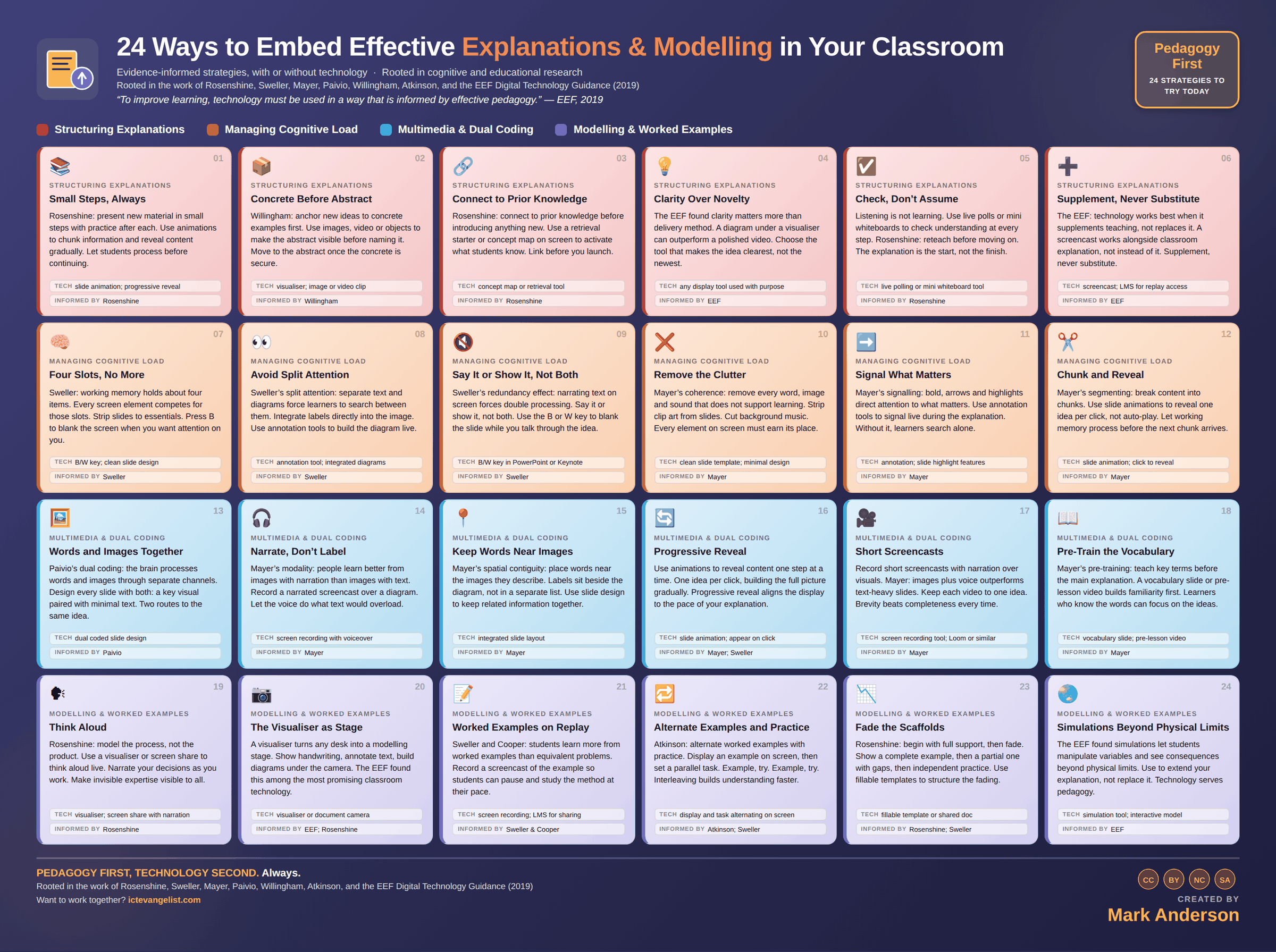
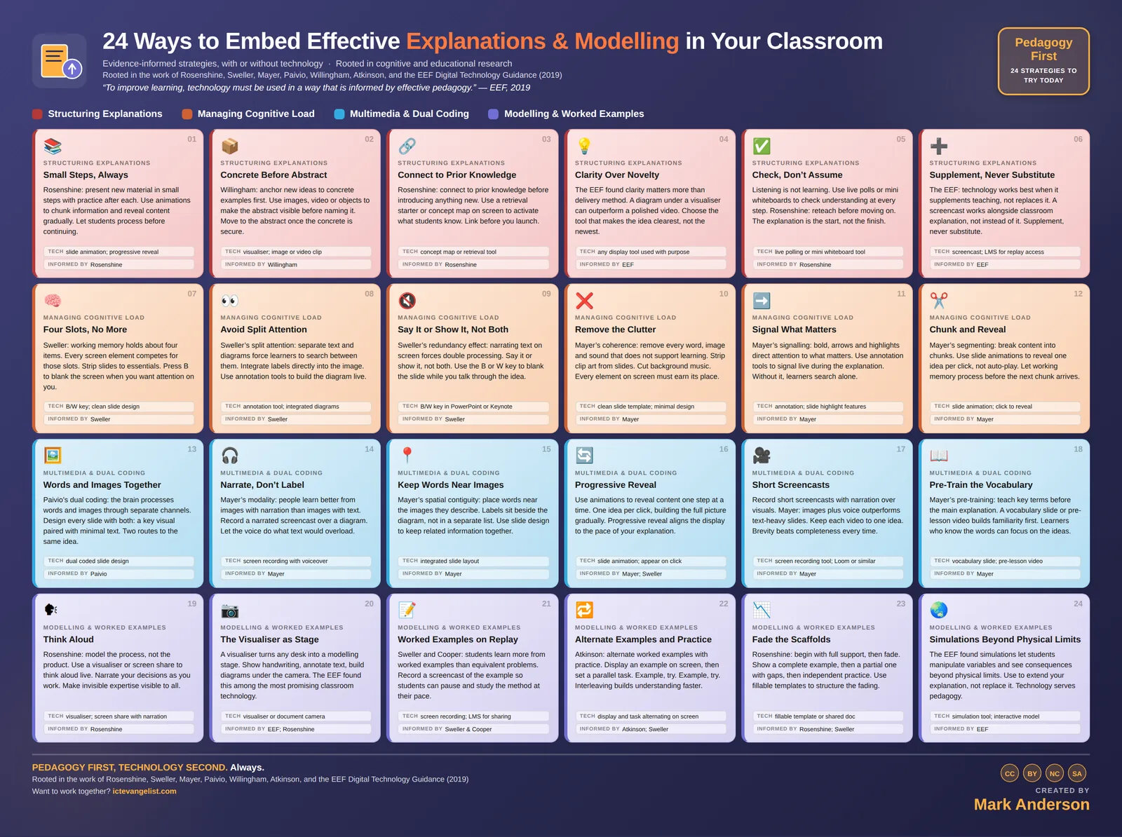
The infographic this chapter expands

The Explanations & Modelling infographic: 24 strategies laid out in colour coded groups, each with a title, a short description, a suggested technology and the researchers behind it. Every strategy is written out in full further down this page.
All 24 on one page. Download the full size image for printing or sharing, or read every strategy expanded below.

The thinking

Why these strategies

Telling is not explaining. An explanation has to be built for the mind that receives it.

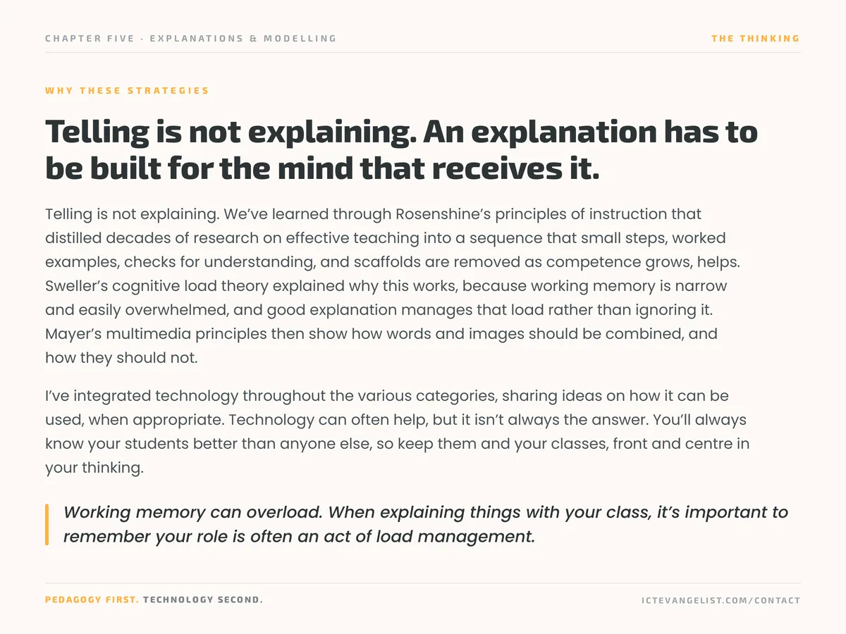
Telling is not explaining. We’ve learned through Rosenshine’s principles of instruction that distilled decades of research on effective teaching into a sequence that small steps, worked examples, checks for understanding, and scaffolds are removed as competence grows, helps.

Sweller’s cognitive load theory explained why this works, because working memory is narrow and easily overwhelmed, and good explanation manages that load rather than ignoring it.

Mayer’s multimedia principles then show how words and images should be combined, and how they should not.

I’ve integrated technology throughout the various categories, sharing ideas on how it can be used, when appropriate. Technology can often help, but it isn’t always the answer. You’ll always know your students better than anyone else, so keep them and your classes, front and centre in your thinking.

Working memory can overload. When explaining things with your class, it’s important to remember your role is often an act of load management.
In practice

Where technology serves

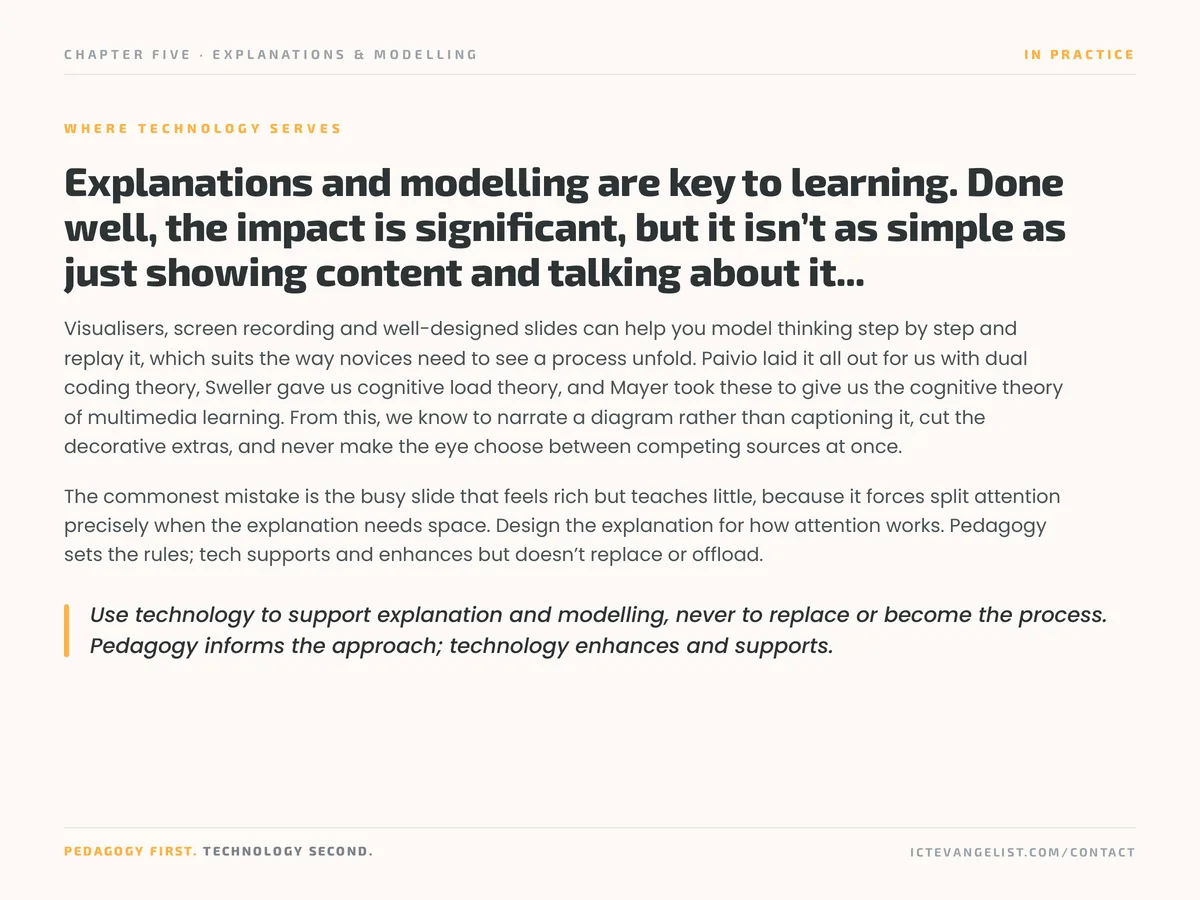
Explanations and modelling are key to learning. Done well, the impact is significant, but it isn’t as simple as just showing content and talking about it...

Visualisers, screen recording and well-designed slides can help you model thinking step by step and replay it, which suits the way novices need to see a process unfold. Paivio laid it all out for us with dual coding theory, Sweller gave us cognitive load theory, and Mayer took these to give us the cognitive theory of multimedia learning. From this, we know to narrate a diagram rather than captioning it, cut the decorative extras, and never make the eye choose between competing sources at once.

The commonest mistake is the busy slide that feels rich but teaches little, because it forces split attention precisely when the explanation needs space. Design the explanation for how attention works. Pedagogy sets the rules; tech supports and enhances but doesn’t replace or offload.

Use technology to support explanation and modelling, never to replace or become the process.

Pedagogy informs the approach; technology enhances and supports.

Knowing whether it worked

How would you know?

Whether students can do it without you, sooner.

Measure how many worked examples a class needs before independent practice holds up, and whether that number falls across a unit. Slide audits are the cheap version: count elements per slide before and after, and see whether check-for-understanding results improve as the count comes down.

Structuring Explanations

6 strategies

Rosenshine: present new material in small steps with practice after each. Use animations to chunk information and reveal content gradually. Let students process before continuing.

Present new material in small steps, with practice after each step, rather than delivering the whole explanation and then setting the task.

Why it works

Rosenshine's principle rests on working memory limits. A long uninterrupted explanation asks students to hold everything until the end, and most can't. Breaking it into steps with practice between them keeps the load manageable and gives you a check at each stage, which means errors surface before they compound.

How to run it

  1. Split the explanation into three or four steps that each make sense alone.
  2. After each step, a short practice: one question, one example, one attempt.
  3. Check before continuing. Whole-class response, not a nod.
  4. Reveal the next step only when the previous one is secure.

Where technology serves

Slide animations and progressive reveal keep the display matched to the step you're on, so students aren't reading ahead while you're still explaining.

Watch for: Steps that are too small fragment the idea and hide the shape of it. The step should be a whole thought, not a whole sentence.

Techslide animation; progressive revealInformed byRosenshine

Willingham: anchor new ideas to concrete examples first. Use images, video or objects to make the abstract visible before naming it. Move to the abstract once the concrete is secure.

Anchor a new abstract idea to something concrete first: an image, an object, a worked case. Name the abstraction afterwards.

Why it works

Willingham's argument is that we understand new ideas in terms of things we already know, and that concrete examples provide the hooks. Starting with the definition asks students to attach meaning to a term that has nothing behind it yet. Starting with the example gives them something to abstract from.

How to run it

  1. Choose two or three concrete examples before you plan the definition.
  2. Show them and ask what they have in common.
  3. Name the concept only once the pattern is visible to the class.
  4. Return to the concrete when the abstraction wobbles later.

Where technology serves

A visualiser, image or short video clip puts the concrete in front of the class quickly, which is often what stops this happening in practice.

Watch for: Examples that share surface features but not the underlying structure teach the wrong pattern. Vary the surface, hold the structure constant.

Techvisualiser; image or video clipInformed byWillingham

Rosenshine: connect to prior knowledge before introducing anything new. Use a retrieval starter or concept map on screen to activate what students know. Link before you launch.

Activate what students already know before introducing anything new, so the new material has somewhere to attach.

Why it works

Rosenshine puts daily review among his principles for this reason: new learning is built on existing schema, and material that connects to nothing is far harder to retain. A retrieval starter does double duty here, strengthening the prior knowledge and priming the connection you're about to ask them to make.

How to run it

  1. Identify the specific prior knowledge today's lesson depends on.
  2. Retrieve it at the start, actively rather than by reminding them.
  3. Make the link explicit: this is why we needed that.
  4. If the prior knowledge isn't there, teach that first rather than continuing.

Where technology serves

A concept map or retrieval tool surfaces the existing structure so students can see where the new content is going to sit.

Watch for: Reminding students of prior knowledge isn't the same as retrieving it. Telling them again strengthens nothing.

Techconcept map or retrieval toolInformed byRosenshine

The EEF found clarity matters more than delivery method. A diagram under a visualiser can outperform a polished video. Choose the tool that makes the idea clearest, not the newest.

Choose the presentation method that makes the idea clearest, not the one that's newest or most impressive.

Why it works

The EEF's digital technology guidance is consistent on this: the evidence favours clarity of explanation over any particular medium, and technology that adds production values without adding clarity adds nothing. A hand-drawn diagram building live under a visualiser frequently beats a polished animation, because the class sees it being constructed.

How to run it

  1. Ask what the hardest part of this idea is to grasp.
  2. Choose the medium that makes that specific part visible.
  3. Prefer live construction to finished artefacts where the process matters.
  4. Be willing to use the simplest possible tool if it's the clearest.

Where technology serves

Any display tool used with purpose. The question is never what the tool can do, it's what the students need to see.

Watch for: Time spent making a resource look impressive is time not spent on whether it explains the thing. The two are easy to confuse while making it.

Techany display tool used with purposeInformed byEEF

Listening is not learning. Use live polls or mini whiteboards to check understanding at every step. Rosenshine: reteach before moving on. The explanation is the start, not the finish.

Why it works

Rosenshine found that the most effective teachers checked understanding frequently and were prepared to reteach. Listening is not learning, and a class that is quiet and attentive can be almost entirely lost. The check has to sample everyone, because the students who signal confusion aren't the ones you most need to hear from.

How to run it

  1. Plan the check points into the explanation, don't improvise them.
  2. Use whole-class response so you see everyone.
  3. Set a threshold in advance: if fewer than most are secure, reteach.
  4. Reteach differently rather than repeating the same words louder.

Where technology serves

Live polling or mini whiteboard tools give you the whole room in seconds, which is what makes frequent checking realistic.

Watch for: Any questions? is not a check. It samples confidence, not understanding, and it selects for the students least likely to need help.

Techlive polling or mini whiteboard toolInformed byRosenshine

The EEF: technology works best when it supplements teaching, not replaces it. A screencast works alongside classroom explanation, not instead of it. Supplement, never substitute.

Why it works

The EEF's conclusion across multiple reviews is that technology has most impact when it supplements teaching rather than substituting for it. The mechanism isn't mysterious: a recording can't read the room, can't notice the confused expression, and can't change tack. It can, however, be paused and rewatched, which live teaching can't.

How to run it

  1. Teach it live, with checks and adaptation.
  2. Provide the recorded version for revision and for absence.
  3. Do not set the video as the first encounter with a difficult idea.
  4. Use the recording to free lesson time for practice and feedback.

Where technology serves

A screencast plus an LMS for replay access covers both cases: the live teaching and the on-demand version students return to.

Watch for: Videos assigned instead of teaching disadvantage exactly the students who most need the responsiveness of a teacher in the room.

Techscreencast; LMS for replay accessInformed byEEF

Managing Cognitive Load

6 strategies

Sweller: working memory holds about four items. Every screen element competes for those slots. Strip slides to essentials. Press B to blank the screen when you want attention on you.

Why it works

Sweller's cognitive load theory distinguishes the load intrinsic to the material from the extraneous load added by how it's presented. Decorative images, dense slides and background detail all consume capacity that was needed for the actual thinking. Blanking the screen when you want attention on you is the simplest available intervention.

How to run it

  1. Strip slides to what is needed for this step.
  2. Press B or W to blank the screen when you're talking and the slide isn't needed.
  3. One idea per slide. If it needs two, it needs two slides.
  4. Ask of every element: what is this doing for the learning?

Where technology serves

The B and W keys in PowerPoint and Keynote are the most underused accessibility and attention feature available, and they cost nothing.

Watch for: Sparse slides can be mistaken for unprepared ones. The preparation went into deciding what to leave out.

TechB/W key; clean slide designInformed bySweller

Sweller’s split attention: separate text and diagrams force learners to search between them. Integrate labels directly into the image. Use annotation tools to build the diagram live.

Keep labels, text and the image they refer to together. Do not make students search between a diagram and a separate key.

Why it works

Sweller's split attention effect describes the load imposed when learners must integrate two sources of information that are physically separated. The searching and holding is extraneous load, spent on logistics rather than learning. Integrating the label into the diagram removes the cost entirely.

How to run it

  1. Put labels on the diagram, not in a legend beside it.
  2. Keep an explanation next to the part it explains.
  3. Where a key is unavoidable, keep it visually adjacent.
  4. Build diagrams live with annotation so labels arrive where they belong.

Where technology serves

Annotation tools let you label as you go, which also paces the diagram to your explanation rather than presenting it complete.

Watch for: Textbooks and exam papers frequently split attention by design. Worth naming that with students so they know the difficulty is in the format.

Techannotation tool; integrated diagramsInformed bySweller

Sweller’s redundancy effect: narrating text on screen forces double processing. Say it or show it, not both. Use the B or W key to blank the slide while you talk through the idea.

Do not read out text that's already on the screen. Say it or show it, not both.

Why it works

Sweller's redundancy effect: identical information presented simultaneously in two forms increases load rather than reinforcing. The learner can't easily ignore either channel, so they process both and reconcile them, which costs capacity. This is one of the most common and most easily fixed problems in classroom presentation.

How to run it

  1. If you're going to talk through it, blank the screen.
  2. If the text needs reading, give silent reading time and stay quiet.
  3. Use the screen for what speech can't do: diagrams, images, data.
  4. Keep on-screen text to short prompts rather than full sentences you'll narrate.

Where technology serves

The B or W key again. It costs one keystroke and removes the redundancy instantly.

Watch for: This doesn't apply to captions or to students who need the text for access. Redundancy for cognitive load and redundancy for accessibility are different questions.

TechB/W key in PowerPoint or KeynoteInformed bySweller

Mayer’s coherence: remove every word, image and sound that does not support learning. Strip clip art from slides. Cut background music. Every element on screen must earn its place.

Why it works

Mayer's coherence principle is that people learn better when extraneous material is excluded. The finding is counterintuitive because the extra material is usually added to increase engagement, and it does increase engagement while reducing learning. Interest generated by decoration competes with the content rather than serving it.

How to run it

  1. Audit a set of your slides and remove everything that isn't doing work.
  2. Be ruthless about images that illustrate the topic but not the point.
  3. Cut background music entirely during explanation.
  4. Adopt a plain template so the default is clean.

Where technology serves

A minimal slide template makes the clean version the path of least resistance, which is the only reliable way to sustain this.

Watch for: Coherence is not the same as dullness. An image that carries the meaning belongs; an image that fills the space doesn't.

Techclean slide template; minimal designInformed byMayer

Mayer’s signalling: bold, arrows and highlights direct attention to what matters. Use annotation tools to signal live during the explanation. Without it, learners search alone.

Direct attention explicitly: bold the key term, arrow the relevant part, highlight the line you're discussing.

Why it works

Mayer's signalling principle finds that cues which highlight the organisation of the material improve learning. Without them, learners spend capacity working out where to look, and they don't always choose correctly. The signal is cheap and it removes a search task that has nothing to do with the content.

How to run it

  1. Highlight or arrow the part you're talking about, as you talk about it.
  2. Signal structure as well as detail: first, second, the key point is.
  3. Keep signals sparse. Highlighting everything signals nothing.
  4. Remove the signal once the class knows where to look.

Where technology serves

Live annotation is more effective than pre-marked slides because the signal appears at the moment attention needs to move.

Watch for: Pre-highlighted handouts signal to the reader before they've read, which can prevent them noticing what mattered themselves.

Techannotation; slide highlight featuresInformed byMayer
12

Chunk and Reveal

Mayer’s segmenting: break content into chunks. Use slide animations to reveal one idea per click, not auto-play. Let working memory process before the next chunk arrives.

Break content into segments and let the learner control, or at least pace, the movement between them.

Why it works

Mayer's segmenting principle finds that learning improves when material is delivered in learner-paced chunks rather than a continuous stream. Working memory needs time to process each segment before the next arrives. Auto-advancing animation removes the pause that the processing requires.

How to run it

  1. One idea per click, not per timer.
  2. Pause between segments and check before continuing.
  3. In recorded material, keep videos short and single-idea rather than long and comprehensive.
  4. Let students control the pace where the format allows it.

Where technology serves

Slide animation set to on click rather than after previous. It's a two-second setting change with a real effect on comprehension.

Watch for: Segmenting a poorly organised explanation just produces poorly organised fragments. The structure has to be right first.

Techslide animation; click to revealInformed byMayer

Multimedia & Dual Coding

6 strategies

Paivio’s dual coding: the brain processes words and images through separate channels. Design every slide with both: a key visual paired with minimal text. Two routes to the same idea.

Why it works

Paivio's dual coding theory holds that verbal and visual information are processed through partly separate channels, and that material encoded in both is better retained. This has nothing to do with learning styles. It's a question of using more of the available processing capacity for the same idea.

How to run it

  1. For each key idea, decide what the visual is before you write the text.
  2. Keep the text to a phrase, not a sentence.
  3. Make the visual carry meaning, not decoration.
  4. Ask students to reproduce the visual from memory later.

Where technology serves

Dual coded slide design is a habit rather than a tool. Any presentation software supports it; most templates encourage the opposite.

Watch for: This is not learning styles. Everyone benefits from dual coding; nobody is a visual learner who should be given only pictures.

Techdual coded slide designInformed byPaivio

Mayer’s modality: people learn better from images with narration than images with text. Record a narrated screencast over a diagram. Let the voice do what text would overload.

When you've a diagram or animation, narrate it rather than labelling it with paragraphs of text.

Why it works

Mayer's modality principle finds that people learn better from graphics with spoken narration than from graphics with printed text. The reason is channel capacity: the visual channel is already handling the diagram, and adding text loads it further, while the auditory channel is free.

How to run it

  1. Where you'd write an explanatory paragraph beside an image, say it instead.
  2. For recorded material, narrate over the visual rather than captioning it.
  3. Keep essential labels on the diagram; move the explanation to speech.
  4. Provide a transcript so the spoken version isn't the only route.

Where technology serves

Screen recording with voiceover produces this naturally, and the recording can be revisited in a way that live narration can't.

Watch for: Narration alone excludes deaf students and anyone in a noisy environment. Captions and transcripts are not optional extras.

Techscreen recording with voiceoverInformed byMayer

Mayer’s spatial contiguity: place words near the images they describe. Labels sit beside the diagram, not in a separate list. Use slide design to keep related information together.

Place words physically near the part of the image they describe, rather than in a block above or below.

Why it works

Mayer's spatial contiguity principle is the presentation-design counterpart of Sweller's split attention. Distance between related elements imposes a search cost. Proximity removes it. The effect is larger than most people expect for a change that's purely about layout.

How to run it

  1. Move labels onto the diagram, adjacent to what they name.
  2. Keep captions next to their image, not at the foot of the slide.
  3. Where a step-by-step explanation accompanies a diagram, place each step by the relevant part.
  4. Check on the actual display size. What is adjacent on your laptop may not be at the back of the room.

Where technology serves

Integrated slide layout, which mostly means overriding the default text-box positions your template provides.

Watch for: Cramming text onto an image to achieve proximity can make both unreadable. Sometimes the answer is a simpler diagram.

Techintegrated slide layoutInformed byMayer

Use animations to reveal content one step at a time. One idea per click, building the full picture gradually. Progressive reveal aligns the display to the pace of your explanation.

Reveal a complex visual one element at a time, building the full picture as your explanation progresses.

Why it works

This combines Mayer's segmenting with Sweller's load management. A complete diagram presented at once invites the learner to process all of it while you're explaining one part. Building it live means what is on screen matches what is being said, and the construction itself shows the relationships between parts.

How to run it

  1. Build the animation to match the order of your explanation.
  2. One element per click.
  3. Pause after each addition.
  4. Show the completed version at the end so students see the whole.

Where technology serves

Appear-on-click animation. Avoid movement effects, which add processing cost without adding meaning.

Watch for: Progressive reveal used for suspense rather than for load management just slows the lesson down.

Techslide animation; appear on clickInformed byMayer; Sweller

Record short screencasts with narration over visuals. Mayer: images plus voice outperforms text-heavy slides. Keep each video to one idea. Brevity beats completeness every time.

Short recorded explanations with narration over a visual. One idea per video.

Why it works

Mayer's multimedia and modality principles together favour images plus voice over text-heavy slides, and the recorded format adds learner control over pace. The brevity matters more than the production quality: a two-minute clip on one idea will be rewatched, and a fifteen-minute comprehensive one won't.

How to run it

  1. One idea, two to four minutes.
  2. Script the first and last sentences, improvise the middle.
  3. Show your working on screen rather than talking over a finished result.
  4. Caption them, or use a platform that captions accurately.

Where technology serves

Any screen recording tool. Do not spend time editing; the value is in the explanation and the availability, not the polish.

Watch for: A library of long videos nobody watches is a substantial investment of your time for very little return. Keep them short or do not make them.

Techscreen recording tool; Loom or similarInformed byMayer

Mayer’s pre-training: teach key terms before the main explanation. A vocabulary slide or pre-lesson video builds familiarity first. Learners who know the words can focus on the ideas.

Teach the key vocabulary before the main explanation, so students aren't decoding terms and following an argument simultaneously.

Why it works

Mayer's pre-training principle finds that learning improves when learners already know the names and characteristics of the main components before the process is explained. Unfamiliar terminology consumes working memory that the explanation needs. Front-loading it means the explanation itself has room to land.

How to run it

  1. Identify the terms in your explanation that will be new.
  2. Teach those first, briefly, with examples.
  3. Check recall of the terms before beginning the explanation.
  4. Keep the terms visible during the explanation.

Where technology serves

A vocabulary slide or a short pre-lesson video builds the familiarity outside the lesson, which returns lesson time to the explanation.

Watch for: Pre-teaching a long list of terms with no context becomes rote definition learning. Keep it to the terms the explanation actually needs.

Techvocabulary slide; pre-lesson videoInformed byMayer

Modelling & Worked Examples

6 strategies
19

Think Aloud

Rosenshine: model the process, not the product. Use a visualiser or screen share to think aloud live. Narrate your decisions as you work. Make invisible expertise visible to all.

Why it works

Rosenshine's emphasis on modelling and worked examples rests on making expert thinking visible. A finished exemplar shows the destination; it doesn't show the route. The decisions an expert makes without noticing, where to start, what to discard, when to check, are exactly the parts novices lack.

How to run it

  1. Work a live example rather than displaying a prepared one.
  2. Narrate the decisions, including the ones you reject.
  3. Include a deliberate wrong turn and show how you notice and recover.
  4. Keep the pace slow enough that students can follow the thinking, not just the writing.

Where technology serves

A visualiser or screen share with narration is the simplest way to do this. The class needs to see the hand or the cursor moving.

Watch for: Modelling that is too fluent hides the process. If it looks effortless, students conclude the difficulty is in them.

Techvisualiser; screen share with narrationInformed byRosenshine

A visualiser turns any desk into a modelling stage. Show handwriting, annotate text, build diagrams under the camera. The EEF found this among the most promising classroom technology.

A visualiser turns any desk into a modelling stage: handwriting, annotation, diagram construction, student work shown live.

Why it works

The EEF has identified visualisers among the more promising classroom technologies, and the reason is how directly they serve modelling and feedback. They remove the friction between having something worth showing and showing it, which is the friction that stops most live modelling happening.

How to run it

  1. Model handwriting and setting out, not just content.
  2. Show student work live, with permission, to critique against criteria.
  3. Annotate texts under the camera so the annotation is a shared act.
  4. Build diagrams by hand so the construction sequence is visible.

Where technology serves

A visualiser or document camera. A phone on a stand with a screen share does the same job if a dedicated device isn't available.

Watch for: Showing student work without establishing a critique culture first can expose a student. Set the norms before the first time you do it.

Techvisualiser or document cameraInformed byEEF; Rosenshine

Sweller and Cooper: students learn more from worked examples than equivalent problems. Record a screencast of the example so students can pause and study the method at their pace.

A recorded worked example students can pause, rewind and study at their own pace.

Why it works

Sweller and Cooper's worked example effect found that novices learn more from studying worked examples than from solving equivalent problems, because problem solving consumes capacity on search rather than on the method. Recording the example adds learner control, which lets students revisit the step they didn't follow.

How to run it

  1. Record the example with narration of the reasoning, not just the steps.
  2. Keep it to one problem type.
  3. Ask students to watch, then reproduce it from memory before attempting a new problem.
  4. Pair it with a parallel problem to attempt immediately after.

Where technology serves

Screen recording plus an LMS for sharing. The pause and rewind is the pedagogical feature, so keep the file easy to reach.

Watch for: The worked example effect reverses as expertise grows. Experienced students learn more from problem solving, so fade the examples as they become fluent.

Techscreen recording; LMS for sharingInformed bySweller & Cooper

Atkinson: alternate worked examples with practice. Display an example on screen, then set a parallel task. Example, try. Example, try. Interleaving builds understanding faster.

Alternate worked examples with practice problems: example, try one, example, try one.

Why it works

Atkinson's and Sweller's work found example-problem pairs more effective than blocks of examples followed by blocks of problems. The alternation means the method is fresh at the point of attempting it, and the attempt reveals whether the example was understood before three more examples have gone by.

How to run it

  1. Structure practice as pairs rather than blocks.
  2. Keep the practice problem parallel to the example, not a variation.
  3. Check after each attempt before moving to the next example.
  4. Increase the distance between example and problem as competence grows.

Where technology serves

Displaying the example alongside the task means students can refer back without turning pages, which reduces split attention.

Watch for: If the practice problem is too different from the example, students can't bridge the gap and the pairing doesn't help.

Techdisplay and task alternating on screenInformed byAtkinson; Sweller

Rosenshine: begin with full support, then fade. Show a complete example, then a partial one with gaps, then independent practice. Use fillable templates to structure the fading.

Move from a complete worked example, to a partially completed one with steps missing, to independent practice.

Why it works

Rosenshine's guidance on scaffolds and Sweller's on completion problems point the same way. A partially completed example carries less load than a blank problem while still requiring the student to do the thinking at the missing step. Fading the support in stages is what transfers the method from you to them.

How to run it

  1. Plan three stages: complete, partial, blank.
  2. Choose which step to remove first based on where the difficulty is.
  3. Remove more steps each time.
  4. Only reach independent practice when the partial version is reliable.

Where technology serves

Fillable templates or shared documents make producing the partial versions quick, which is what usually prevents this being done properly.

Watch for: Scaffolds that never fade produce dependency. Plan the removal at the same time as you plan the support.

Techfillable template or shared docInformed byRosenshine; Sweller

The EEF found simulations let students manipulate variables and see consequences beyond physical limits. Use to extend your explanation, not replace it. Technology serves pedagogy.

Use simulations to let students manipulate variables and see consequences that are impossible, dangerous or too slow in a real classroom.

Why it works

The EEF's review of digital technology identifies simulations as valuable where they let learners explore relationships that couldn't otherwise be observed. Changing the mass of a planet, running a reaction a hundred times, compressing geological time. Used to extend an explanation this is powerful; used to replace one it removes the teacher from the part that needed judgement.

How to run it

  1. Explain the underlying idea first.
  2. Give a specific investigative question, not free exploration.
  3. Require a prediction before they run the simulation.
  4. Debrief against the explanation so the simulation is connected back to the theory.

Where technology serves

Simulation and interactive modelling tools. Choose ones where the variables map to what you're teaching, not ones with the most features.

Watch for: Unstructured time on a simulation produces engagement and very little learning. The prediction and the debrief are where the value sits.

Techsimulation tool; interactive modelInformed byEEF

Want this thinking in your school?

I run keynotes, INSET and workshops on pedagogy, AI and digital strategy, and I work with schools and trusts over time rather than one day and gone. Tell me where your team is and I'll tell you honestly whether I can help.

Back to top